Showing posts with label fixtures. Show all posts

Friday, October 5, 2012

Student Design Competitions


There are some really great competitions going on right now for design students! Competitions are a great way to not only see how your skills compare to other students' around the country, but to begin getting your name out there in an industry that is very competitive.

So if you are a undergrad student currently enrolled in an Interior Design or a related college program, and are interested in the possibility of winning a little exposure (and prize money--that never hurts, right??), check out a few of these competitions!
1. IIDA Student Sustainable Design Competition
"The competition celebrates original sustainable design and rewards those individuals whose projects demonstrate consistent, creative sustainable principles."

Submission Deadline: November 15, 2012
Official rules and entry here.

2. PAVE the Way 3D Design Challenge 
"PAVE the Way, a 3D Design Challenge is an exciting opportunity available for students internationally to showcase their work at a major industry event, GlobalShop 2013."

The Challenge: "Design and create a 3D model or rendering of a store fixture that communicated an existing brand of headphone."

Submission Deadline: November 16, 2012
Official rules and entry here.


3. PAVE Student Design Competition
"The competition's design challenges consist of a visual merchandising category and a store design category and provide an excellent opportunity for students to obtain real-life retail design experience."

Visual Merchandising Challenge: "To create a window display AND entry merchandiser that successfully communicate the Bonobos brand."

Store Design Challenge: "To create a “pop-up” shop that successfully communicates the Bonobos brand."

Submission Deadline: November 1, 2012
Official rules and entry here.  


4. ASID Student Design Competition: Repurpose for Today
"How can you, as a designer, create an environment that helps address a current social crisis?

The Challenge: "Scour the media to come up with a social issue on which you think you can make an impact. Then find a building, trailer, bus, train or other environment that you can use to address and transform the social issue by repurposing for today. Utilize creative and critical thinking skills to develop an informed design." 

Submission Deadline: November 15, 2012
Official rules and entry here.

sources: one . two . three . four

Friday, September 7, 2012

Space Saving Furniture

I live in a small house--and when I say small, I mean it. We've got a downstairs with very little space division, a lofted upstairs, and two very, very small closets where I have to shove what seems like every possession we have into on a regular basis. To be perfectly clear, we need more space--or we need less stuff, whichever. Regardless, when I received an email from my boss recently about a new line of multipurpose, space saving furniture, it got me thinking about all the possibilities small spaces hold if a little forethought is put into their design and furnishings. Whether you are dealing with a small residence, office, or retail space, there are countless space saving ideas and fixtures that will meet a number of needs--all in one compact package.

Let's take a look at a few of my favorites...and I don't know about you, but many of these made me think, "well duh, why didn't I think of that??"

1. Boxetti

Designed by Rolands Landsbergs, each modules "is designed to achieve maximum efficiency of particular demands for functionality and suitability," and boy, does it look good doing it. I love the modern look and clean lines of this collection--from the office, to the bedroom, to the kitchen, this line can make even the smallest spaces functional. Check out the full collection here.


2. Club

Created by Daniel Debiasi and Federico Sandri for the German manufacturer Schönbuch, this space saving mirror/wardrobe combo would be perfect in a small home or clothing store.


3. As if from nowhere...

Designed by Orla Reynolds, I can think of countless places that this piece would be useful, i.e. my own home! A fully functional bookcase discreetly houses two tables and four chairs, making the need to worry about unexpected guests a thing of the past.


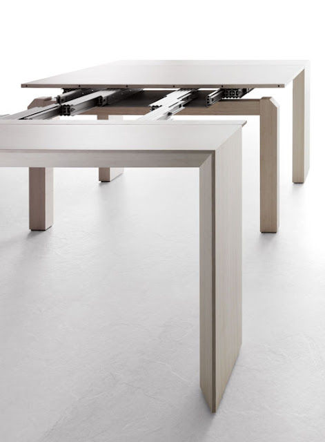
4. Minuetto Space-Saving Table

Produced by Italian manufacturer Milano Smart Living, this piece is great for anyone living in tight quarters. "It starts out as a console table but quickly transforms into a large dining table big enough to seat 10 people"--um, what?! That, my friends, is good engineering.


5. Folditure Leaf Chair

Created by architect Alexander Gendell, this chair folds to less than 3/4" thick and can be hung in a closet when not in use. With an aluminum composite frame and sturdy mesh seat, this durable chair is suitable for both indoor and outdoor use.


6. Twin Chair

This chair, designed by Philippe Nigro, is a clever two-in-one deal that allows a person to use the chairs stacked, or two people to use them separated--great for times when you need extra seating but can't afford to have chairs taking up space on a full-time basis.


Are you a small space dweller? Do you have a piece of space-saving furniture that has made your life a little easier? Leave a comment and let us know!

sources: one . two . three . four . five . six . seven . eight . nine . ten . eleven

Wednesday, August 29, 2012

Retail Security Solutions

Working in the retail fixture industry, Advanced Cabinet Systems fulfills numerous requests from customers wanting their displays to be as secure as possible. Would-be thieves are getting craftier and often times it seems that if a product is not nailed down, there is the potential that it will grow legs and walk right out of your store. If your security devices can be picked, cut, deactivated, or broken off, someone will find a way--resulting in a loss of profit for your business and loads of frustration for you.

In order to offer our customers the best security devices to meet an ever-growing list of needs, we try to stay as up to date as possible on what the market has to offer. Below are a few of our go-to products that we have found to be reliable options for combating retail theft. This may seem like a paid advertisement for one company, but trust me it's not, we just really like their products!

1. Invue Series 1000 Impact Display Stands
These stands feature an internal recoil mechanism that returns the product to the display position each time it is handled. It also has a built-in alarm that will sound if the device is disconnected from the stand--and speaking from experience, it is a loud alarm that no one in the store is going to miss! These stands provide users with a lot of flexibility, giving them the option to secure dummy phones, charge live phones, or provide customers with an interactive display that is triggered when the device is lifted from the base.

2. Invue Locking Gridwall Hooks
Many of our customers stock their accessories on grid wall panels, and these locking hooks from Invue are a great way to keep products secure, while still being quick and easy for employees to remove when necessary. 

3. Vanguard Cell Phone Security Stands
Similar to the Invue stands above, Vanguard Products Group offers a wide range of security options for hand held devices, tablets, and accessories. These devices offer the same user-friendly options when it comes to displaying products, while providing peace of mind that items are safe and secure.

4. Invue Cabinet Lock
Invue cabinet locks are great choice for retailers looking to retrofit existing cabinetry--with no tools or drilling required, installation is a snap. This lock features PowerTouch technology that transfers power from the key to the lock, meaning you will never have to worry about replacing batteries, providing years of worry-free security.

5. Invue LTO2 Tablet Security
New to Invue, this product can power up any tablet on the market while keeping it secure and functional when on display. The display stand allows the product to be mounted either vertically or horizontally, while remaining virtually invisible from the front--keeping product displays clean and uncluttered.

A large portion of my design work is geared toward the technology industry and I realize that is where most of these security solutions would be most useful. So, I would love to hear from you--what kind of security measures do you take to ensure that your merchandise doesn't fall prey to sticky fingers?

sources: one . two . three . four . five

Tuesday, July 31, 2012

Wood v. Chemical Resistant Plastic Laminates

For years, wooden cabinets have been the go-to solution for the storage of equipment and chemicals in science laboratories across the nation. From middle school labs to the more advanced labs found in higher education buildings, the general consensus among fixture specifiers seemed to be that wood was the best solution for these areas. In recent years, however, companies like Wilsonart and Formica have worked to change the minds of these individuals with the introduction of chemical resistant plastic laminates.


Although wood has the ability to withstand the physical wear and tear that a typical lab is routinely subjected to, it naturally omits acids and other pollutants, with oak (most often used) being the worst offender. The porous nature of wood allows it to easily absorb odor and contamination, as well as potentially harbor mold and other bacteria, all of which can be detrimental to sensitive test results. The density and hardness of plastic laminate means that it omits very little chemical gasses, and as long as it is glued to an NAUF substrate, offgasing of this material should also be of little concern.


Wilsonart’s Chemsurf and Formica’s ChemTop2 lines are an affordable alternative to wood cabinetry, wainscoting, and in some settings, are even suitable for use as counter tops. Each line carries a large variety of colors and patterns, making them great choices for lab areas that need to make a big statement. If the customer desires the look of wood with the functionality of laminate, they also come in a wide range of realistic wood grains. Each product's ability to resist harsh chemicals, stains, and mild abrasion make them a durable, long-lasting option for intermediate-type labs in hospitals, schools, and factories.


Over time, as wood surfaces are exposed to strong chemicals, excessive cleaning, and in some instances heat, they tend to lose their protective finish--leaving them susceptible to corrosion and staining. However, in rigorous product testing, both Wilsonart and Formica's chemical resistant laminates held up beautifully, with only a slight change in color or gloss when exposed to bright light and certain chemicals over prolonged periods of time.


While wooden casework needs routine cleaning and polishing to maintain its durability, with chemical resistant plastic laminate you simply wipe the surface clean--no scrubbing or harsh cleaning agents are required--offering years of superior performance that is unmatched by its competitor.

sources: one . two . three . four

Wednesday, July 18, 2012

Flexible Learning Environments

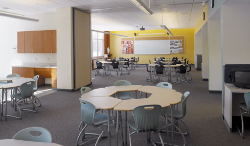
As a follow up to last week's blog, "Environmental Effects on Learning", I've compile a few examples of well designed classrooms from across the web. These spaces show a creative use of color, materials, and furnishings while maintaining a high level of flexibility that allows them to be used for a wide range of activities.

As a student, I know I would have loved learning in these environments!

Desks and chairs on casters keep this space flexible and allow for quick and easy reconfiguring.

Brightly colored and ultra-portable, these desks can turn any space into a fun learning area.

Moveable glass walls and multipurpose furniture make this space perfect for both teacher led discussions and group collaboration.

A desk/chair combo on wheels allows for an unlimited number of seating configurations.

Brightly colored furniture makes this classroom a fun and inviting learning environment.

A large room with moveable furniture allows for multiple learning activities to take place simultaneously.

In many climates, a covered outdoor area can be utilized by students nearly year round, giving them access to fresh air and sunshine.

A large room with walls that tuck neatly away provides just the right amount of classroom space, while still allowing the space to be utilized by larger groups.

Moveable window-walls help bring in the outdoors in this learning environment.

A compact stage/bleacher area saves spaces and makes this corridor functional.

sources: one . two . three . four . five . six . seven . eight . nine . ten

Friday, July 6, 2012

Selecting Flooring and Paint

Flooring and paint selection are two elements of retail design that when chosen correctly can save you a lot of headache down the road. It is important to specify finishes that are commercial grade and will hold up well in a retail setting. While the initial investment for commercial materials may be higher, the cost will eventually even out--and in some cases even be lower--in comparison to purchasing non-commercial grade products, as they will often need replaced sooner. This is a key component in making sure the money you spend upfront implementing your design is not wasted on fixtures and finishes that are not meant to withstand retail traffic. The materials you choose should not only look and function well, but have minimal maintenance requirements.

Flooring

There are several things to consider when choosing flooring for your store...
  1. What kind of mood are you trying to set? Commercial flooring companies now offer their products in a wide range of colors and materials. Gone are the days of traditional floors in neutral colors, as designers are making flooring an important part of the design concept with bold colors and patterns.

    Colorful Floors
  2. How much foot traffic will the flooring get? Durability is vital in choosing a commercial grade floor covering as the product will often need to withstand a large number of customers each day. If possible, choose a flooring that is easy to clean and hides dirt and scuffs well. Consider investing in carpet tiles--as individual squares can quickly be replaced should the need arise--but make sure to purchase enough replacements from your original dye-lot as colors can often vary from one lot to the next.

    wood_big
  3. How much standing will my employees and customers do? If the answer is a lot, it is important to choose a material that will help to reduce fatigue and potential leg and back pain. As a general rule, the less amount of give that a surface has, the harder it will be on your joints. Choosing a softer flooring with a little bit of give to it will greatly benefit employees that need to stand all day. If you are dead set on having, say, exposed concrete floors, do your employees and customers a favor by adding anti-fatigue mats in areas that they will be standing at most throughout the day. Trust me, they will thank you!


  4. Is noise an issue? If so, stick with softer finishes that will absorb the sound of footsteps or invest in a good underlay that will help quiet walking noise on laminate or hardwood floors.

    Interior decorating carpets decor
Paint


Paint comes in a wide variety of finishes that can either work for you or against you. Choosing the correct finish for your walls and fixtures will ensure that they are easy to clean and will not need repeated touch ups or repaints that are both time consuming and costly.
  1. Matte/Flat: This is the least glossy finish which makes it a great choice for covering existing wall colors or hiding imperfections. It is very susceptible to stains and scuff marks and does not hold up well against scrubbing, therefore it is best applied to ceilings and low traffic areas. 
  2. Eggshell and Satin: These finishes have a hint of glossiness compared to flat, with satin being the glossier of the two. They are durable and easy to clean making them a good choice for walls in nearly every type of setting. 
  3. Semi-Gloss: Even glossier than eggshell and satin, this finish offers great durability in high-traffic areas that will receive heavy cleaning regularly. Semi-gloss is a great choice for cabinets and trim, as well as high moisture areas such as restrooms and kitchens. 
  4. Gloss: Drying to create an almost laminate-like surface that is extremely durable, this finish is not typically used in interiors. 
sources: one . two . three . four . five

Monday, June 18, 2012

Space Planning

In continuing our series on retail design, this week I thought we would take a look at a few ways to optimize your retail space. Whether you run a small specialty boutique or a large discount warehouse, it is important to consider customer flow and product placement in order to utilize the space to its full potential and help drive sales.


There are three areas that are important to keep in mind when you are planning the layout of your store:

1. Entrance
2. Sales floor
3. Check out area

Specialty retail is a very competitive field and with so many other stores vying for a shopper's attention it is important to have an enticing entrance. Well executed window displays will often give a customer a nice glimpse of what they can expect to see in your store. Once you get their attention, it is important that the entrance be spacious to avoid the bottleneck effect that comes with funneling too many customers through an opening that is too small. While it may make sense to place your best products at the entrance, research done by Envirosell, a company that studies customer behavior, have shown that these items often get overlooked by shoppers eager to get inside the store. As people have the natural tendency to go right when they enter a space, better placement for these products would be about 15 steps in on the right side. This will allow the customer enough time to gain their bearings of the space and begin the shopping process.


When laying out the sales floor, it is important to consider the main circulation path that customers will take as they walk through the space. A well thought out path will lead shoppers through the most important departments of the store and prevent areas from being under-shopped. The type of circulation path that you use will depend on what your store is selling, but it ultimately comes down to making people comfortable as they shop in your store. If a shopper is confused and overwhelmed by your space, it is likely that they will turn around and walk out pretty quickly, leading to a lost potential sale. Customers that are engaged and find it easy to locate the products they are looking for will often shop longer and purchase more.


While there are a number of circulation path layouts that can be utilized, here are a few of the most common:
  • Pathway: This plan is great for clothing stores, as it easily moves the customer toward the back of the store on a path that is unobstructed by fixtures.
  • Hub and Spoke: This plan features a clear anchor point with pathways branching off into various areas of the store.
  • Varied: This plan works well in stores that primarily display their products on the wall, such as shoe and jewelry/accessory stores. It draws attention to special displays areas and showcases wall displays.
  • Straight: This plan leads the customer to the back of the store by dividing main areas with walls to display merchandise, making it great for a variety of stores.
  • Loop: This plan works great for grocery stores, as it leads the customer through all of the major areas of the store and encourages impulse shopping.
The circulation path you choose will often dictate where you place your check out area. Customers should have a clear understanding of where they need to go to complete their purchase, and in many cases, it is important to provide a sense of privacy during the transaction. As technology continues to evolve, many retailers are moving away from providing a physical cash wrap to complete the sale and equipping their sales team with hand held devices capable of doing the job of a traditional cash register--and often faster. This allows associates to move freely about the store, making them more accessible to the customer.


A few more things to consider during the space planning process...

1. Pace: In order for a customer to enjoy their experience at your store, they must be the one to set the pace at which they shop. Providing areas for customers who wish to shop longer and at a slower pace, as well as accommodations for those that need to get in and out of the store quickly, will ensure that everyone is satisfied.


2. Product Placement: The placement of merchandise throughout your store must make sense to your customer. However, what makes sense to one person may not make sense to the next and this is where cross merchandising--placing the same product in different areas throughout the store--helps to make products easy to find while decreasing customer confusion (and frustration).

3. Building Codes: As building codes can vary significantly from one city to the next, it is important to know the codes in your area before investing valuable time and money into a space plan that doesn't meet all of the requirements.

4. Market: Know the market you are trying to reach and set a limit on how much product you will display at any given time. Crowded stores often reflect lower prices, while fewer products on display typically gives a higher-end feel.


5. Flexibility: Make a plan that is flexible and can be changed around easily without tearing the entire store apart. This will not only save your staff time but will also save you money.

6. Privacy: Give your customers enough room to move. Avoid stressful situations for your shoppers by providing space that is out of the flow of traffic where they can make buying decisions without being interrupted.

What tips do you have on creating a successful retail space plan? Have you found that a particular type of circulation path leads to increased sales? Let us know in the comments below!

sources: one.two.three.four.five.six

Monday, June 11, 2012

Lighting 101

The design department at Advanced Cabinet Systems is currently in the process of creating a totally new—and awesome (in my unbiased opinion)—look for one of our biggest clients. We are extremely excited about the direction it is headed and can't wait to see the first store installed! As we wrap up the design process, I thought it would only be fitting to put together a mini-series on the ins and outs of successful retail design.
 
This week, I will begin with lighting. Unfortunately, this is often one of the most overlooked and under-budgeted aspects of retail design, but let’s face it people, it is so important. Let me reiterate, lighting can make or break your design. A well thought out lighting plan needs to be at the forefront of your design process, not tacked on the backend and thrown together simply to serve the purpose of providing light for a room.


While every space will present a unique set of lighting challenges, there are 3 basic aspects that should be worked into your lighting plan.

1.  Ambient Lighting
2.  Task Lighting
3.  Accent Lighting

Ambient lighting, also known as general lighting, provides the overall illumination for the space. The level of these lights should be bright enough to allow customers to walk safely through the store, but at a comfortable level to avoid creating a glare.


Task lighting is used to make intricate tasks, such as reading price tags or ringing up a customer’s purchase, easier for both employees and shoppers. Adequate task lighting should allow these activities to be completed quickly, while minimizing mistakes.


Accent lighting draws attention to special product displays and promotions, helping to communicate the store image. A good rule of thumb when planning for accent lighting is that the product you are showcasing will typically require a minimum of five times the amount of lighting to adequately set it apart from its surroundings. Higher ratios are used for feature displays or to add sparkle to jewelry and crystal, these can range anywhere from 15:1-30:1. Also keep in mind that accent lighting requires a lot of flexibility, making track lighting a perfect choice when the time comes to choose your lighting fixtures. 


If you are wanting to take your lighting plan to the next level and add even more depth and personality than the above categories can accomplish, consider adding the following lighting fixtures to your space...

1.  Perimeter Lighting
2.  Decorative Lighting

Perimeter lighting draws shoppers away from the main aisle and into the areas where merchandise is located. It improves visibility around the edges of the store, while adding to the overall comfort and ambiance of the location, both of which directly correlate with a customer’s desire to shop longer. Perimeter lighting can be achieved by recessing fixtures in a ceiling cove or positioning light sources close to the wall.


Decorative lighting adds a home-like quality and comfort to a retail space, helping to put customers at ease while also encouraging them to stay longer. This type of lighting can go far in communicating the store brand’s image to the customer by adding a unique style to the space. Lighting fixtures that fit into this category include pendants, sconces, chandeliers, lighted signage/graphics, and table and floor lamps.


As I mentioned earlier, each store presents its own unique set of lighting challenges but knowing what general category your store falls into will help you better access the lighting requirements of the space.

Category A: Large stores with high ceilings. This can include warehouses, discount merchants, and supermarkets. These types of spaces require a bright, uniform distribution of light that allows for easy navigation of the space.


Category B: Large open spaces, including department stores, specialty shops, life style shops, and higher end discount merchants. These stores offer more specialized, yet still competitively priced, products compared to Category A, and it is within these locations that you will begin seeing different layers of light that give the impression of a higher end shopping experience.


Category C: Smaller, upscale specialty shops, fine jewelry, and designer boutiques. These retailers require a unique presentation of their lighting in order to draw customers in and through their store. These locations often feature lower levels of light that provide the shopper with a more personal, home-like atmosphere.


Okay, now that we have covered the basics of lighting design, let’s take a look at a few tips and mistakes to avoid when lighting your retail environment.

Layer lighting where it counts.

If you are not working with a huge lighting budget, make sure you are getting the biggest bang for your buck by creating an attractively lit environment in areas that feature your money making items. A good example of this concept at work is in Macy’s department stores. Their designer labels, specifically in the women’s department, as well as their makeup and accessory areas feature beautiful lighting schemes that are multi-layered and very effective at creating a high end feel. Their children and teen areas are then lit with adequate ambient lighting and may feature the occasional accent lighting. While this may not create the most attractive environment throughout these departments, Macy’s has identified its best selling products and chosen to focus the majority of resources to those areas.


Make sure spotlights shine on the product and not in the customer’s eyes.

During a recent trip to the mall (let’s call it a research trip), I noticed multiple offenders of this mistake. It is a simple yet effective fix in your lighting design that will only add to the comfort of your customers.


Be careful not to over (or under) light your store.

While walking through the mall it was very obvious which stores were lacking in the lighting design department. The ones that were over lit somehow seemed to scream “cheap merchandise inside”, while those that were under lit felt a little too depressing. While I know that there are several shops that use bright or dim lighting schemes to appeal to a particular customer base, what I’m really trying to get across here is that it is obvious when a retailer has their branding in mind, or when poor lighting is a result of a lack of planning.


The color temperature of your lights is important.

Define what your brand hopes to communicate to the customer and then choose your lights accordingly. Are you trying to create a cozy, comfortable atmosphere? Warm light sources mixed with low levels of ambient light and high intensity accent lights are what you need. Does your store sell a wide selection of primarily low price goods? If so, stick with cool light temperatures as they communicate to the customer that they are getting a bargain. Along with color temperature, it is important that your lights are high enough on the Color Rendering Index for customers not only to be able to see a product’s fine details, but to clearly identify it from a distance.


While any lighting designer would tell you there is a great deal more that goes into creating a successful lighting plan, the above elements should give you a good start to creating a beautifully lit retail environment.

How much attention do you pay to a store’s lighting? Does it affect your desire to shop at certain retailers?