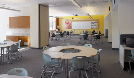
Throughout the design process of our most recent line of retail fixtures, I was approached numerous times with questions pertaining to color; what color should the pieces be, the flooring, the walls? Choosing the wrong color for any of these elements held the potential to throw off the atmosphere we were working so hard to create.
Since color has the incredible ability of evoking an emotional response in most people, it plays a huge role in either making or breaking a design. A well thought through color palette can do wonders for mediocre design, while a poor choice of colors can put a damper on even the greatest of designs.
Let’s take a look at the feelings colors are able to stir within us, as well as a few great applications of color throughout the design world...
Red:
- Excitement, passion, attention, love
- Red can make a small room feel even smaller--try incorporating it on one or two accent walls.
- Pairing red with bold prints and patterns can help tone down the saturation of the color.
- Studies have shown that predominately red rooms may lead to a temporary increase in blood pressure.
Orange:
- Playful, energetic, cheerful
- Orange has all of the personality of red without being as aggressive.
- It pairs nicely with white, modern furnishings and bold prints.
- Orange is a hunger-inducing color.
- When it is closer to peach in hue, orange has the ability to enhance some complexions, making it a great choice for a restroom or changing room.
Yellow:
- Sunny, tropical, safety
- Yellow is a great choice for poorly lit spaces as it helps to brighten the area more effectively than white.
- Pair yellow with white accents for a cheerful, relaxed atmosphere.
- Yellow walls combined with black accents will create an unexpected modern twist in an otherwise elegant setting.
Purple:
- Royalty, wealth, intrigue, creativity
- Purple combines the stability of blue with the energy of red.
- It is believed that purple helps to develop imagination in children, making it a great choice for playrooms and classroom settings.
- Like the majority of highly saturated colors, purple pairs nicely with an otherwise neutral palette.
Green:
- Relax, inspire, nature, renewal
- The relaxing qualities of green make it an excellent background color for meditation and tasks that require a high level of concentration.
- Deep shades of green will produce a more opulent atmosphere, while lighter shades tend to create a fresh, lively setting.
Blue:
- Relax, refresh, inspire
- While blue holds many of the same relaxing qualities of green, light blue can make large areas feel cold and bleak while may lead to distress in people confined to the space for long periods of time.
- Mixing white accents within a blue room creates a light, airy atmosphere, making this combination perfect for sunrooms, reading rooms, and bedrooms.
White:
- Purity, cleaness, calm
- White is the perfect neutral background for all other colors.
- Under-stimulation with this color can lead to restlessness and difficulty concentrating, therefore, great care shoul be taken to balance a stark white room with enough color to add warmth and visual interest to the space.
Gray:
- Neutrality, stability, respect
- Similar to white, gray provides an excellent neutral palette for other colors and textures.
- Dark, saturated hues of gray can be used to create an elegant atmosphere, while adding warmth and sophistication to the space.